News
24 December 2025
Delo Group Unveils a Unified Visual Brand Ecosystem
 As part of a large-scale rebranding initiative, Delo Group updated its corporate identity, brand architecture, and brand book. The update reflects the holding company’s internal evolution into a comprehensive logistics ecosystem and aims to unify visual communications across all assets, emphasizing their affiliation with Delo Group.
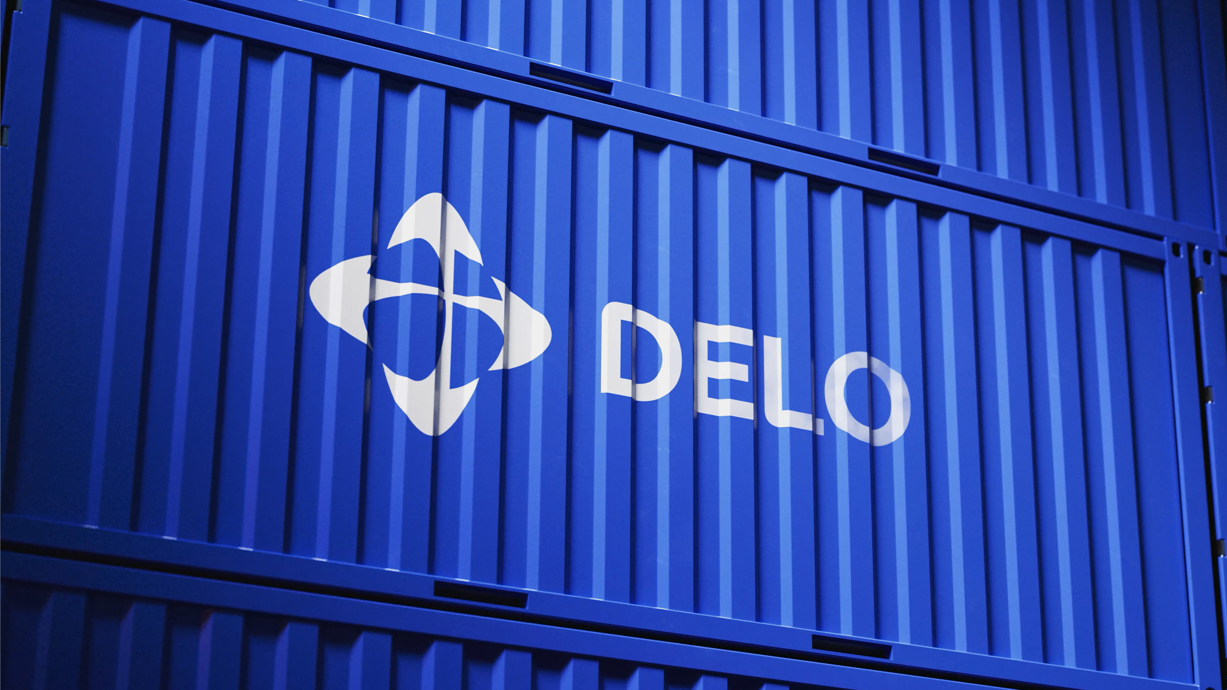
In June 2025, a new logo was introduced, preserving brand continuity through the globe symbol, the familiar blue-and-white color palette, and the core principles of sub-brand identity. The Group has now completed the formation of a unified visual brand ecosystem and has moved on to the comprehensive unification of media and application standards.
The brand architecture is built on a hybrid model. The primary brand asset is the parent brand, Delo. The second level consists of brand extensions representing the Group’s business areas, using a combination of the parent logo and the extension name set in the corporate typeface. The third level includes brands endorsed by the parent brand, for which the core construction rules and the mandatory descriptor “DELO GROUP OF COMPANIES” are retained, confirming their affiliation with the system. The architecture is designed as a flexible framework that can evolve and expand without losing integrity, supported by consistent typography and a clear visual hierarchy.
The graphic system is based on a signature corporate element: intersecting lines whose direction is derived from the logo. The red line is the primary element, moving from bottom to top and from left to right, symbolizing leadership, growth, and ambition. Blue and white lines serve as supporting elements; they are thinner and positioned beneath the main line. The resulting graphics are light, modern, and minimalist, easily adaptable to any format and seamlessly integrated with photography.
A unified communication design system was developed, covering business documentation, reports, presentations, corporate brochures, and a concept for the corporate website. A line of branded merchandise was also created, carefully integrating red accent lines, recognizable graphic motifs, and the established color combinations.
The project culminated in a detailed brand book defining consistent rules and standards for every element of the identity. Based on this foundation, dedicated brand books for the sub-holdings were produced.
The rebranding project was implemented in full by the LINII branding agency. < Back to list